Project Life Update - Week of 4/1 to 4/7
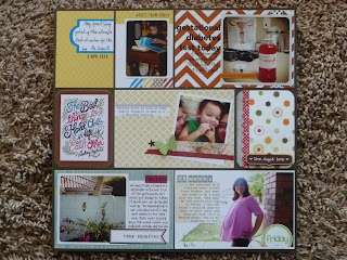
Left side. I totally lifted the title card from here. I saw it on Pinterest and fell in love with the colors. Of course, I never clicked through to the source and now that I'm linking I see it's a Designer Digital one. I guess that means you can have one too and you don't even have to sketch it all out in Photoshop first!
One of the things I'm loving about digi scrapping the cards is that it makes it easy to share the detail of the cards without having to photograph each one.
Bubba at church on Palm Sunday. The font is Susie's Hand. I Googled "faux bois" and found that blue pattern for the "washi tape." I think it was a Martha Stewart rug, actually!
Making my palm fronds into crosses.
Bubba's first Instagram photo. The washi tape is from here. The font on the journaling is Susie's Hand again. The title font is Candice.
My husband gets really happy when he can find Hot Wheels that look like ones he played with as a kid. As a result, Bubba has stuff like the A-Team van and a DeLorean in his collection. The latest acquisition was this orange Dodge Charger that he has dubbed the General Lee. Every time he gets one of these, they look up video clips on YouTube so they can watch the cars in action.
The title font here is Applescruffs. I know the journaling font is one of Kevin and Amanda's handwriting fonts, but I forget which.
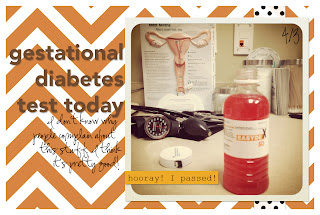
You may recognize this photo from my April Photo A Day Challenge post. I Googled "vintage floral" to find the flower pattern I used to make the digi washi tape. Chevron background was made using one of the overlays from here.
Right side.
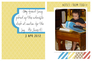
My friend Suzy brought Bubba a desk. Needless to day, he LOVED it. Journaling font is Susie's Hand again. Date and title font is Hootie.
That same chevron overlay from Mel Stamps, just sized differently.
A Moroccan tile overlay, also from Mel Stamps was used for this background. The washi tapes were things I found on Google image search and then made into tape strips. After the photo was printed I punched a butterfly from some green patterned paper using a Martha Stewart punch and stuck it in place with a pop dot. You can see it if you scroll back up to the completed page. The Polaroid style frame for my photo and the file folder label I made myself in Photoshop.
This is the same blue faux bois pattern I used on the tape for an earlier card. Hootie for the date, Courier New for the title. I can't remember the font for the journaling, but it's probably another Kevin and Amanda font.
Me in my tunic from Fresh Produce. The journaling font is Courier New, which I'm loving lately. The title is Avenir, I think. I have no idea what the font I used on Friday was. Whoops!
There were a couple of empty spaces this week, so I just filled them with patterned paper and misc. embellishments I had laying around. The baker's twine on the left side, bottom row I actually made myself using embroidery floss. I don't remember where I found the tutorial for that, but it was a pain!
Labels: Project Life


2 Comments:
Love the way you do Project Life. First I thought I wanted to do it digitally, but then I decided to do it in paper... and now I want to do it like you do. Thank you for great inspiration :)
I LOVE that vintage floral tape. I've been trying to find some real tape that has a floral pattern I like, but to no avail. Maybe I'll just have to make my own digital version like you did. Thanks for the tip.
P.S. I love you're style for PL. I think you just got yourself a new follower. :)
Post a Comment
Subscribe to Post Comments [Atom]
<< Home