


Holy Crap Starbucks!
Seriously, some people are the WORST prudes.
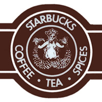
Anyone who has been to the Pike Place Market in Seattle, or heck, even knows anything about Starbucks and their origins knows that the current corporate logo is NOT the original Starbucks logo. The original logo is a Siren, from Greek mythology, but since Sirens are topless (hooray for boobies) they decided to cover those bad boys up with her hair and crop/stylize the image.
Well, apparently September marks Starbuck's 35th anniversary, and to celebrate, they are using limited edition cups with the original logo.
 There are people who are actually crying PORNOGRAPHY over this!!!! Honestly, sometimes I am ashamed to live in such a nation of prudes. We are a country founded by Puritans, and we just can't seem to get past that as a whole. It's not even like it's an accurate representation of the female breast, it's a freaking cartoon line drawing!
Some people need to get over themselves. It's drawn BOOBS. Not porn, not filth, not lack of morals, not the next coming of Playboy. It's a beautiful part of the human anatomy. (unlike the penis, which is another ball of ugly I am not prepared to dish about at this time!) It's a shame that we teach our children that something as innocuous as a breast has to be a dirty thing.
Anyone who has been to the Pike Place Market in Seattle, or heck, even knows anything about Starbucks and their origins knows that the current corporate logo is NOT the original Starbucks logo. The original logo is a Siren, from Greek mythology, but since Sirens are topless (hooray for boobies) they decided to cover those bad boys up with her hair and crop/stylize the image.
Well, apparently September marks Starbuck's 35th anniversary, and to celebrate, they are using limited edition cups with the original logo.
Some people need to get over themselves. It's drawn BOOBS. Not porn, not filth, not lack of morals, not the next coming of Playboy. It's a beautiful part of the human anatomy. (unlike the penis, which is another ball of ugly I am not prepared to dish about at this time!) It's a shame that we teach our children that something as innocuous as a breast has to be a dirty thing.
Miss M told you so @ 12:22 AM
![]()


3 Comments:
I totally agree with you! Yay for boobies! LOL I can't believe people are getting upset over this with all the stuff they show on tv and movies these days. :rolling eyes:
that is ridiculous! is the logo going on the cup or the little heat things? i hope the latter so i can scrap it. i have a ton of starbucks stuff to do a mini album of my addiction.
i noticed today that they have the pumpkin spice latte back. yea!!
s.
I knew nothing about this but agree wholeheartedly!
Mmmm pumpkin spice is one of my favorites!!
Post a Comment
Subscribe to Post Comments [Atom]
<< Home